Aaaaand… here we go!
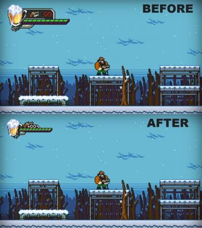
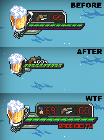
After an extra 24 hours we’re finally back on air (so to speak), and we’d like to use this update to unveil one of the improvements the game has undergone in the past few months: a brand new HUD towering the top-left corner of the screen.
Compared to the previous interface, the new HUD is much smaller, sleeker, and the minimal background behind the weapon icon means significantly less wasted space.
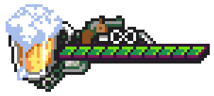
While the beer mug is less detailed than before, we believe it’s a fair trade-off.
In fact, the change addresses one glaring flaw found during the extensive playtesting over the past few months; the HUD was simply too big, and could obscure important details on screen, entire enemies included.
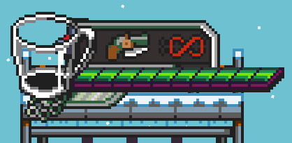
The other visual improvements will be discussed in later posts, but we still have a small goodie to show today: HUD design is a tough job, and you only get good results through iteration and testing. So, even the previous interface wasn’t the first we tried out after switching to 2D from the top-down version of the game.
Introducing our first attempt… THE JUGGERNAUT!
