The dialogue boxes shown up until now may have looked vintage enough for our retro aesthetic, but they also covered a pretty large portion of the screen. Because of that, we recently decided to revise them a bit.
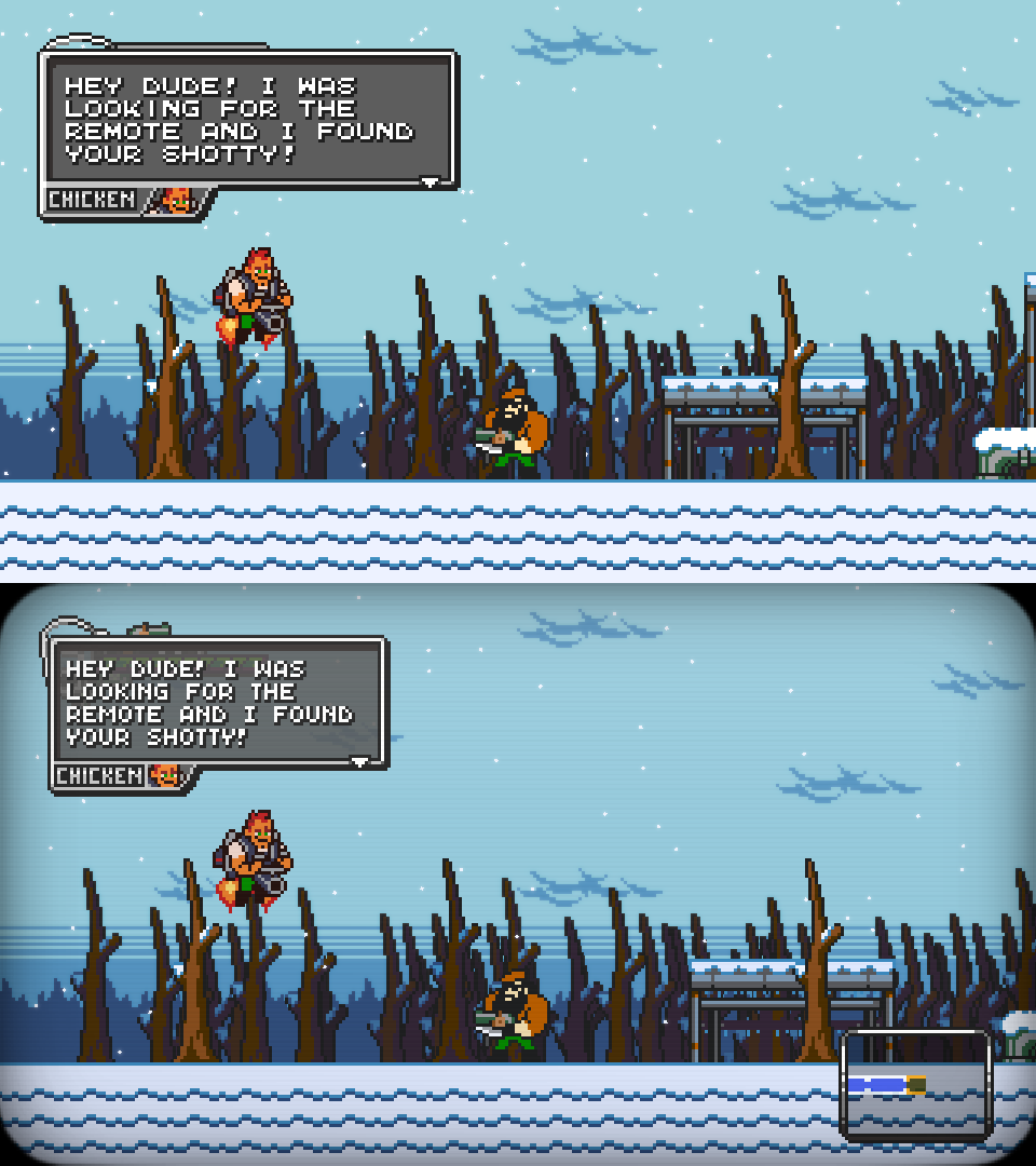
As highlighted by this comparison screenshot, we made the font thinner and non-monospaced to improve readability, and removed some dead space from the window frame. We also made their background slightly transparent, preventing parts of the scenery from getting hidden and, at the same time, making them appear more varied and less monotonous.
The end result is a smaller box that doesn’t completely hide important onscreen elements anymore; fitting better with some visual features we honestly can’t wait to introduce when the time comes.